


⭐ How to Create a Stylish Print-Ready Flyer or Magazine Ad
Creating a stylish print-ready flyer or magazine ad is one of the most important steps in promoting your business, services, or brand. While digital marketing is powerful, print materials still offer a strong, lasting impact—especially when they’re designed with clarity, creativity, and purpose. Whether you’re a small business owner, freelancer, designer, or marketer, understanding how to create a professional print-ready design can instantly elevate your brand image. This guide will walk you through everything you need to know to craft a high-quality flyer or magazine ad that stands out and captures attention.


1. Understand Your Purpose and Target Audience
Before opening any design software, begin by identifying the goal of your flyer or magazine ad. Is it to promote a sale, launch a new service, announce an event, or build brand awareness? Clear objectives help you shape your layout, visuals, and messaging.
Understanding your audience is just as important. Your design should appeal to the demographics you’re targeting—whether it’s homeowners, professionals, students, or local customers. A stylish design is not only visually appealing but also relevant and aligned with your audience’s expectations.

2. Start with a Strong Headline
A flyer or magazine ad only has a few seconds to grab attention. This makes your headline the most powerful element of your design. It must be bold, concise, and easy to read. Use strong, benefit-driven language that instantly communicates what the reader will gain.
Examples:
- Upgrade Your Home with Our Expert Carpentry Services
- Limited-Time Offer: Premium Woodwork at Affordable Prices
Your headline should be immediately recognizable and placed at the top or center of your design, depending on your layout.
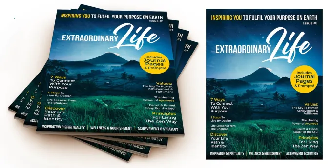
3. Use High-Quality Visuals
Images and graphics play a central role in stylish and professional print designs. Make sure to use high-resolution images (300 DPI) to ensure they appear sharp when printed. Avoid pixelated or stretched visuals, as they can weaken the perceived quality of your brand.
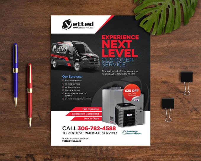
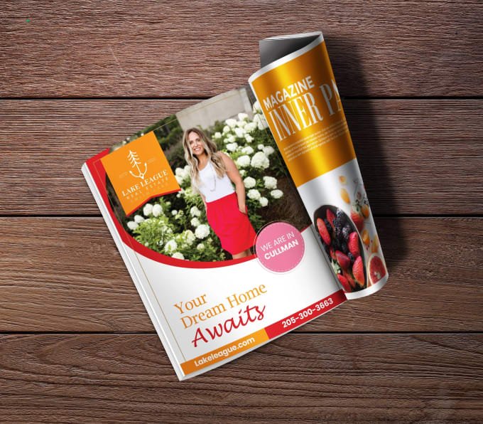
If you’re designing a carpentry flyer or ad, for example, showcase real images of your craftsmanship, tools, workshops, or finished projects. Authentic visuals help build trust and credibility.
You can also incorporate design elements such as icons, shapes, patterns, or background textures to add personality—just make sure the visuals complement, rather than overwhelm, the message.
4. Keep Your Layout Clean and Organized
A stylish flyer or magazine ad should be visually balanced, easy to follow, and not overcrowded. Use a grid or column layout to keep elements aligned and structured. Prioritize your content using size, spacing, and hierarchy.
Here are some layout tips:
- Leave enough white space to prevent clutter.
- Use consistent margins throughout the design.
- Align text and images for a clean, professional look.
- Ensure the eye moves naturally from headline → content → call-to-action.
A simple, uncluttered design is often more attractive and memorable than one overloaded with information.

5. Choose Professional Fonts and Typography
Typography plays a big role in shaping the style and readability of your flyer or magazine ad. Use no more than two or three fonts to maintain a cohesive look. Combine a bold headline font with clean, readable body text.
Consider the tone you want to convey:
- Modern brands often use sleek sans-serif fonts.
- Luxury or premium services may use elegant serif fonts.
- Creative or rustic styles may include handwritten or textured fonts—but use them sparingly.
Be sure your text is readable from a distance, especially the headline and key information, such as dates, prices, or services.
6. Stick to a Consistent Color Scheme
Colors influence emotions and brand perception, so choose a palette that aligns with your business identity. If you already have brand colors, use them consistently across your print materials.
If not, aim for a color scheme with 2–4 colors that work well together. Use strong contrast to make important elements stand out. For example, dark text on a light background is more readable than the opposite.
Also, remember that colors print differently than they appear on screens. Always design in CMYK color mode for accurate print output.

7. Include Clear and Compelling Content
Stylish design is important, but the message itself must also be clear and compelling. Write short, concise, benefit-driven text that tells the reader exactly what you are offering and why it matters.
Your content should include:
- A headline
- A short description or bullet points
- Key selling points
- Contact information
- Address, website, or social media details
- A strong call-to-action (CTA)
Examples of effective CTAs:
- Call Today for a Free Estimate
- Book Your Service Now
- Visit Our Website to Learn More
Keep your content focused on what the customer gains by choosing you.
8. Ensure Your Design is Print-Ready
To make your flyer or magazine ad truly print-ready, you need to follow professional printing guidelines:
Print-Ready Requirements:
- Resolution: 300 DPI
- Color Mode: CMYK
- Bleed: 0.125 in (3 mm) around all edges
- Safe Margins: Keep important text at least 0.25 in from the edge
- File Format: PDF (preferred), TIFF, or high-quality JPEG
Including bleed ensures that your design prints edge-to-edge without unwanted white borders.
Before sending your file to print, double-check for spelling errors, alignment issues, color inconsistencies, and image quality. A final proof review prevents costly mistakes.
9. Maintain Brand Consistency
Your flyer or magazine ad should reflect the overall identity of your business. Use consistent fonts, brand colors, logo placement, and tone of voice. This helps your audience recognize your brand instantly, whether they see you online, in print, or in person.
Consistent branding builds trust and ensures your marketing materials look polished and professional.
10. Design Software Options
You can design stylish print-ready flyers or magazine ads using professional software like:
- Adobe Illustrator
- Adobe InDesign
- Adobe Photoshop
- Canva (Pro recommended for print settings)
Choose the tool that fits your skill level and printing needs.