
How to Design a Creative Beauty Skincare Logo
Designing a beauty or skincare logo is more than just choosing pretty colors—it’s about creating a visual identity that represents softness, femininity, purity, and trust. A well-designed logo helps skincare brands stand out in a competitive market and creates an emotional connection with customers.
Below is a professional step-by-step guide to designing an effective and creative beauty skincare logo.
1. Understand the Brand First
Before starting any design, you must know the brand deeply. Ask questions like:
- What is the brand personality? (luxury, minimal, natural, youthful)
- Who is the target audience? (women, teens, organic lovers)
- Is the brand modern, soft, bold, or premium?
- What type of skincare products do they sell?
A good logo always starts from understanding the brand emotion, not just visuals.
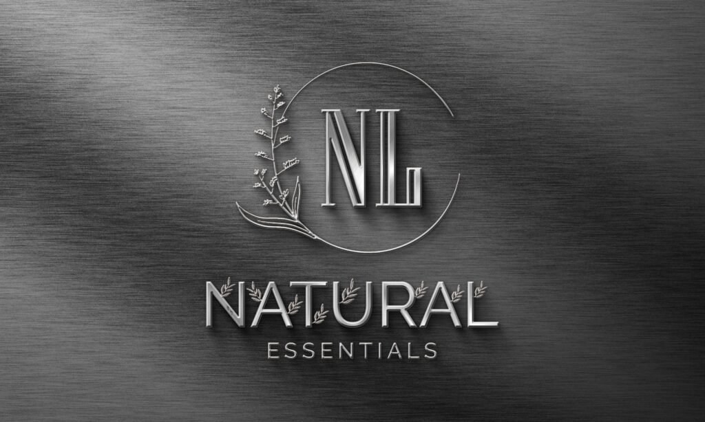
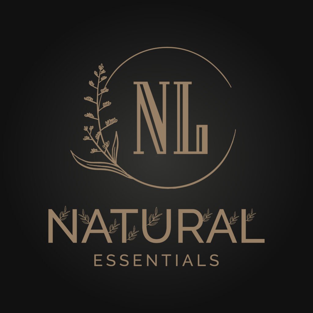
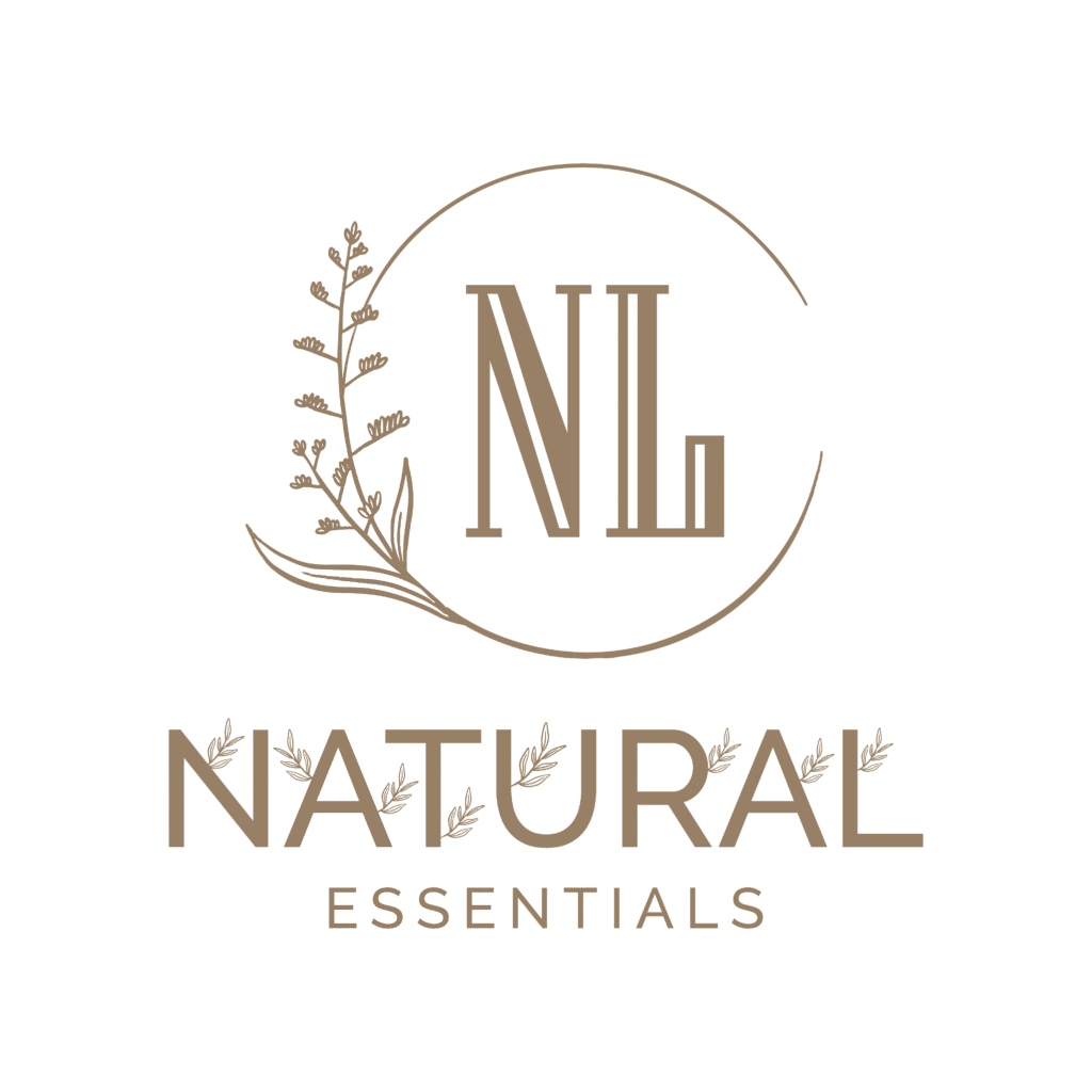
2. Choose the Right Style
Beauty and skincare brands commonly use these styles:
✓ Feminine & Elegant
Thin lines, floral shapes, pastel colors.
✓ Minimal & Modern
Clean typography, simple symbols, geometric shapes.
✓ Organic & Natural
Leaf icons, earthy colors, handcrafted look.
✓ Luxury & Premium
Gold touches, serif fonts, soft gradients.
Choose a style that matches the brand personality.
3. Pick the Perfect Color Palette
Colors influence customer emotions. For beauty and skincare, these colors work best:
- Soft Pink → Feminine, gentle
- Beige / Nude → Minimal, natural
- Pastel Green → Organic, fresh
- White / Cream → Clean, pure
- Gold → Premium and luxurious
Avoid too many bright or harsh colors for skincare brands.
4. Select Suitable Fonts
Typography is extremely important in beauty branding.
Best font styles for skincare logos:
- Serif Fonts → luxury, high-end feeling
- Elegant Script → feminine and soft
- Modern Sans-Serif → clean and minimal
Pro Tip:
Use 1–2 fonts only to keep the logo clean.
5. Add a Simple Symbol (Optional)
A symbol makes a logo memorable, but it must be creative and meaningful.
Popular symbols for skincare logos:
- Leaves
- Flowers
- Face line art
- Drops (serum/cream)
- Sun or moon
- Organic shapes
Keep the symbol minimal — avoid too much detail.
6. Focus on Balance & Simplicity
A good beauty logo must be:
- Easy to read
- Scalable (small or large)
- Clean and simple
- Emotionally appealing
Remember: Less is more in beauty branding.
7. Create Variations
Prepare different versions:
- Main logo
- Icon/monogram
- Horizontal layout
- Vertical layout
- Black & white version
This helps the brand use the logo everywhere — packaging, website, labels, ads, etc.
8. Finalize in High-Quality Formats
Export the final logo in:
- PNG (transparent background)
- JPG
- SVG/AI/PDF (vector)
- CMYK files for print
This ensures professional use across all platforms.


Leave a Comment