
How to Do Luxury Makeup, Beauty & Cosmetic Logo Design
Luxury beauty brands require a logo that feels premium, elegant, and high-end. Unlike simple or playful beauty logos, luxury cosmetic branding focuses on sophistication, minimalism, and timeless design.
Below is a step-by-step guide to help you create a luxury cosmetic logo that attracts premium clients and stands out in the beauty industry.
1. Understand the Luxury Beauty Brand
Before designing, learn the brand’s identity:
- Is the brand high-end, minimal, feminine, bold, or modern?
- Who is the target audience? (premium buyers, makeup lovers, skincare enthusiasts)
- What type of products? (cosmetics, skincare, fragrance, makeup tools)
Luxury branding is all about exclusivity and refined style.
2. Choose a Luxury Design Style
Luxury beauty logos typically fall into these styles:
✓ Minimal & Elegant
Clean shapes, simple typography, refined details.
✓ Premium & Glamorous
Gold accents, elegant serif fonts, delicate symbols.
✓ Modern Luxury
Geometric shapes, monogram initials, bold contrast.
✓ Feminine Luxury
Soft curves, light lines, pastel tones with gold.
Choose the one that fits your client’s brand essence.
3. Select a Luxury Color Palette
Color is key to making a logo look luxurious.
Best luxury colors for beauty & cosmetics:
- Gold → premium, royal, elegant
- Black → bold, high-end
- White → clean, minimal, modern
- Nude/Beige → soft, feminine
- Rose Gold → beauty & makeup focused
- Deep Brown / Chocolate → natural luxury
- Blush Pink → feminine premium
Avoid too many bright or neon colors — luxury means subtle and refined.
4. Choose High-End Fonts
Luxury logos depend heavily on typography.
Top font styles for luxury cosmetic brands:
- Serif fonts → timeless, elegant, premium
- Didone-style serif fonts → luxury fashion-style
- Modern sans-serif → sleek and clean
- Delicate script (minimal use) → feminine touch
Use 1 or 2 fonts maximum.
Spacing (letter spacing) also increases luxury appeal.
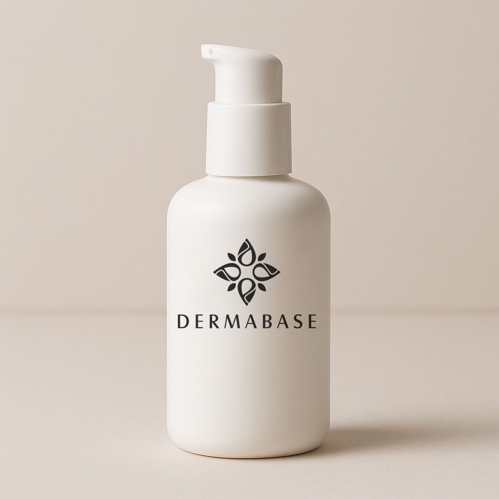
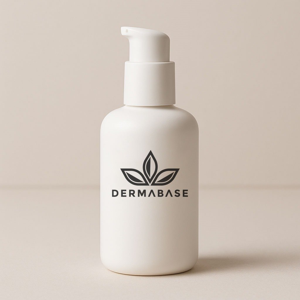
5. Add a Simple & Elegant Symbol
Luxury symbols should be minimal and meaningful, not overly detailed.
Common luxury beauty logo symbols:
- Monogram initials (e.g., “S” or “MB”)
- Minimal floral line art
- Face outline
- Eyelash/eye shape (for makeup brands)
- Droplet or leaf shape
- Geometric shape
- Crown or diamond (subtle)
The symbol must enhance the logo, not overpower it.
6. Focus on Minimalism
Luxury design = simplicity with elegance.
Key principles:
- Keep shapes clean
- Use negative space creatively
- Avoid too many colors
- Avoid clutter
- Make the logo breathable (space between elements)
Simplicity makes the brand feel expensive.
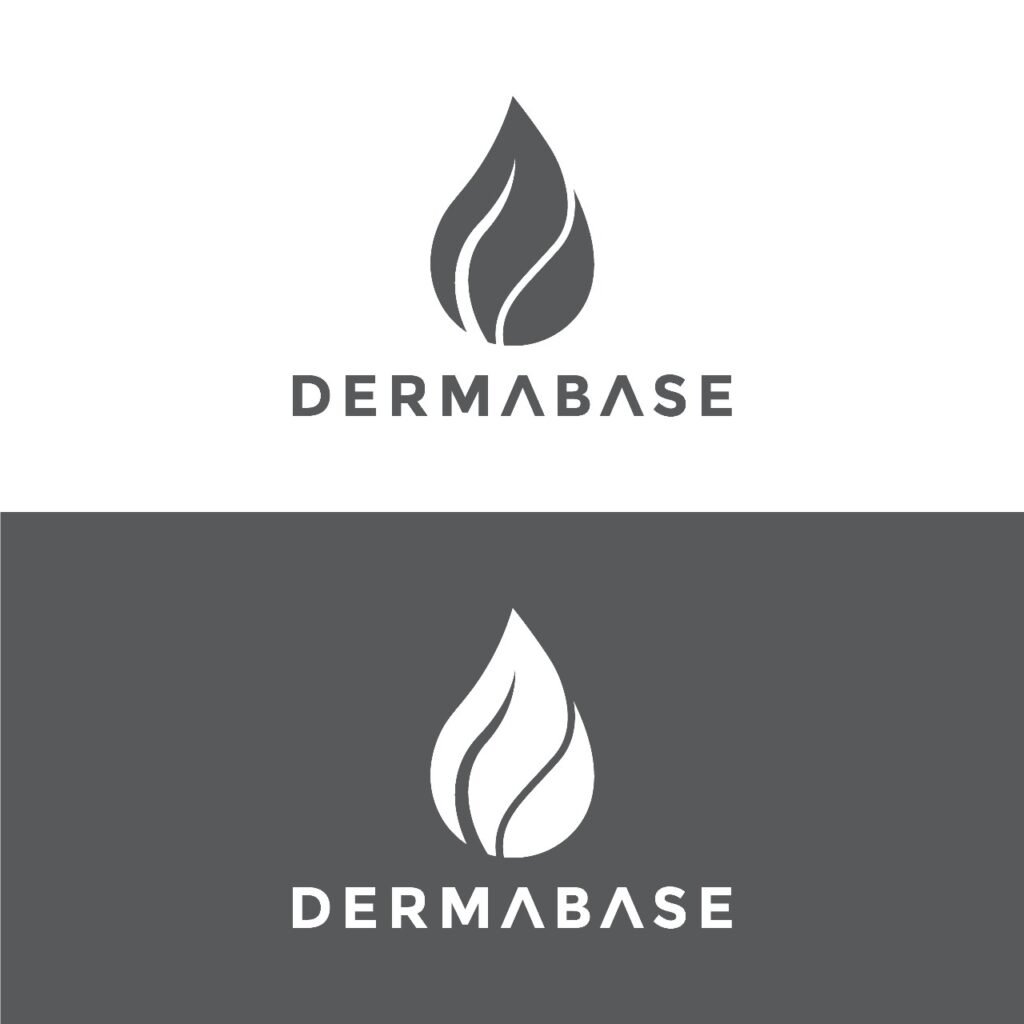
7. Test the Logo in Different Layouts
Luxury logos must be flexible for:
- Product packaging
- Bottle labels
- Makeup palettes
- Website headers
- Social media icons
- Brand bags & boxes
Create variations:
- Main logo
- Icon/monogram
- Horizontal version
- Vertical version
- Black & white version
8. Prepare High-Quality Final Files
Export professional files:
Vector Files:
- AI
- EPS
- SVG
Raster Files:
- PNG (transparent)
- JPG
Color Variants:
- Full color
- Black version
- White version
Brand Guide (Optional):
- Color codes
- Typography
- Logo usage rules
Luxury clients value complete brand identity packages.


Leave a Comment